
How to read a pressure map, and which way the wind blows
“Wind flows almost parallel to the isobars on a pressure map, clockwise around a high and anticlockwise around a low in the Northern Hemisphere, and the opposite way round south of the equator. Tightly packed lines mean strong wind, widely spaced lines mean very little. Stand with your back to the wind up north and low pressure sits on your left. That one rule lets you read a map in about four seconds.”
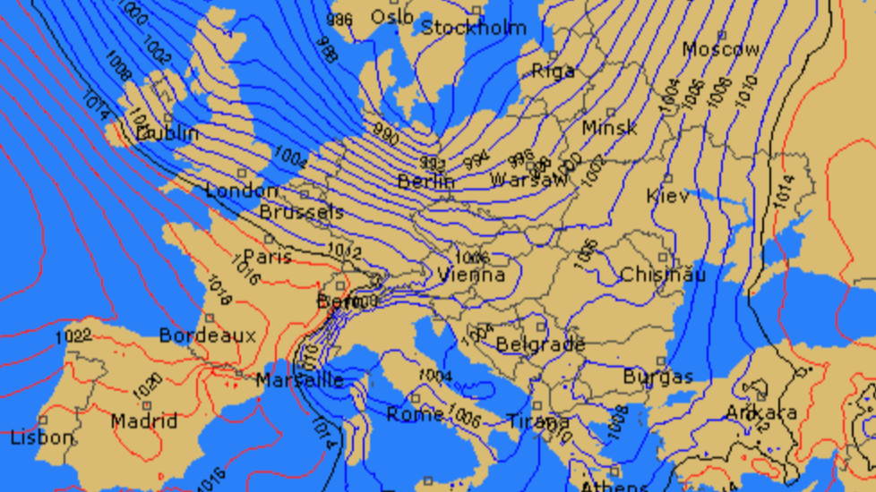
Ever stared at a weather map and wondered whether you are looking at wind, rain, or the inside of a spaghetti bowl? Pressure maps look intimidating. Circles, numbers, lines that appear to have been drawn by someone having a bad day, and no obvious connection to whether you should load the van tomorrow.
Here is the thing that changed it for me. A forecast app hands you a number and asks you to trust it. A pressure map hands you the reason, which means you can see the wind coming two or three days before the app is willing to commit to anything. It is the difference between being told what the wind will do and understanding why. And once someone shows you the four rules that actually matter, the spaghetti turns into a sentence.
The invisible squeeze that makes wind
Air moves from high pressure to low pressure, and the harder the squeeze, the faster it moves. That is the entire foundation, and everything else on this page is detail hanging off it.
Pressure is just the weight of the atmosphere pressing down on a spot. Average sea level pressure is about 1013 hPa, so anything meaningfully above that is a high and anything meaningfully below is a low. Air always tries to flow from the high toward the low, the same way air rushes out of a balloon rather than into one.
What it does not do is take the direct route, which is where most people get stuck, and where the next two sections come in. If the reason air moves at all is still fuzzy, the whole loop from sun to sea breeze is worth ten minutes before you carry on here, because a pressure map only shows the middle of that story.
Which way does the wind blow around a high?
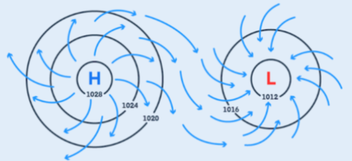
Clockwise, and spiralling gently outward, if you are in the Northern Hemisphere. In the Southern Hemisphere it is anticlockwise and still outward.
The reason is the rotation of the earth. Air leaving a high tries to head straight for the nearest low, but the planet turning underneath it bends the path to the right in the north and to the left in the south. That bend is the Coriolis effect, and it never stops, so the air ends up curving around the system instead of crossing it.
What that means when you are standing on a map:
A high sitting west of you in the north pushes wind at you from the south.
A high sitting east of you sends it from the north.
A high directly over you gives you very little of anything, because the air is sinking rather than moving sideways.
That last one is the trap. A big fat high parked on your coast looks glorious on a satellite image and is often completely useless, because the pressure is even in every direction and nothing is being squeezed anywhere.
Which way does it blow around a low?
Anticlockwise and spiralling inward in the Northern Hemisphere, clockwise and inward in the Southern Hemisphere. Exactly the reverse of a high, for exactly the same reason.
And here is the shortcut that makes all of this usable at a glance, a rule sailors have been using for about a hundred and sixty years:
Stand with your back to the wind. In the Northern Hemisphere, low pressure is on your left. In the Southern Hemisphere, it is on your right.
That is Buys Ballot’s law, and it works in reverse too, which is the useful direction for us. Find the low on the map, work out where it sits relative to your beach, and you know which way the wind arrives without reading a single number. In Cape Town the rule flips, so a low to the south of you puts the wind on your right when your back is to it, which is part of why the southeasterly does what it does down there.
One refinement, because pure theory would have the wind running exactly parallel to the lines. Friction at the surface drags the flow slightly off course, pulling it inward toward a low by roughly ten to thirty degrees, less over open water and more over rough land. So the wind you actually get is close to parallel with the isobars, angled a little toward the centre of the low.
How do you read isobars?
Isobars are lines joining places with the same air pressure, exactly like contour lines on a walking map join places at the same height. Wind runs almost parallel to them, so the lines are not decoration, they are the direction arrows.
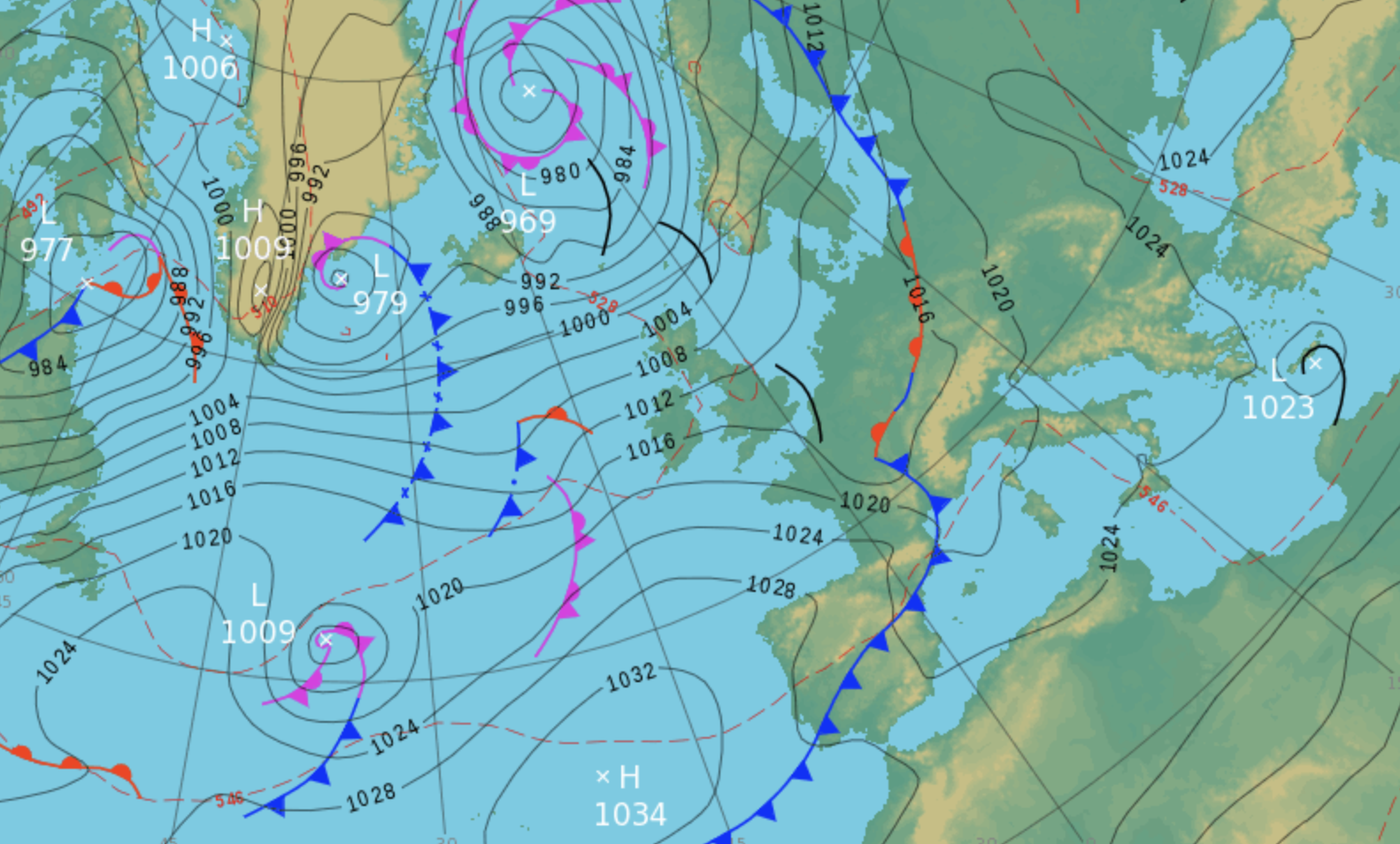
Three things to look at, in this order:
The numbers on the lines. Above 1013 is high pressure, below is low. This tells you which system you are looking at.
Which side of you the system sits. With Buys Ballot in your head, this gives you direction in about four seconds.
How close together the lines are. This gives you strength, and it is the part people skip.
Reading them is genuinely closer to reading a contour map than to doing meteorology. Steep ground means the lines bunch up. Steep pressure means the same thing, and it produces the same result, which is that things move faster downhill.
Tight lines mean wind, wide lines mean nothing
The spacing between isobars is the pressure gradient, and the pressure gradient is the wind. Lines crammed together mean a big pressure change over a short distance, which means air moving fast. Lines spread lazily apart mean a gentle change, which means a flat day and a lot of standing around.
| What the map shows | What to expect on the water |
|---|---|
| Isobars crammed tight over your coast | Strong wind, size down, this is the day you were waiting for |
| Moderate, evenly spaced lines | Rideable and usually steady, the bread and butter forecast |
| Wide, lazy spacing | Little to nothing, whatever the app is optimistically claiming |
| Tight lines wrapped around a deep low | Strong but gusty and shifting, ride with a plan |
| A large high sitting right on top of you | Sunshine, flat water, no wind, bring a book |
Compare the same chart across three days. Lines tightening near your coast means it is building, and you see that before the app does.
The comparison that matters is between maps rather than within one. Pull up the same chart for three consecutive days and watch whether the lines near your coast are tightening or relaxing. Tightening means it is building, and you will see that a day or two before a forecast app shows you a bigger number.
Highs, lows, and kite moods
A high gives you steady, clean, predictable wind when it gives you any at all. A low gives you more of it, less politely.
| What to compare | High pressure | Low pressure |
|---|---|---|
| Wind strength | Moderate at best, often light | Stronger, sometimes a lot stronger |
| Consistency | Steady and even | Gusty and shifting |
| Sky | Clear, sinking air, few clouds | Cloud, rain, fronts, drama |
| Best for | Learning, foiling, flat water, long sessions | Big air, powered riding, short windows |
| Watch for | Nothing arriving at all | Squalls, sudden direction changes, overpowering |
Low pressure for big air, high pressure for flat water and learning. A big high directly overhead often means no wind at all.
The reason a low feels punchy is not just that it is stronger. Air spiralling into a low is rising, and rising air means convection, and convection is the machinery that manufactures gusts. Since that vertical mixing is what turns smooth wind into lumpy wind, a low pressure day and a gusty day are usually the same sentence said two different ways.
Highs and lows also favour different places entirely. Trade wind destinations like Cape Verde and Fuerteventura run on the edge of a big semi permanent high, which is why they are so reliable. Northern European coasts run on a conveyor belt of Atlantic lows, which is why the season there is winter and why nobody promises you anything.
When the pressure drops fast, pack up
A rapid pressure fall is the single clearest storm warning you will ever get, and it needs no app. If the pressure at your spot drops more than about 3 hPa in three hours, something serious is arriving.
What a fast drop is telling you:
A deep low is deepening further, or moving toward you quickly, or both.
The gradient is about to steepen, so wind will increase faster than any forecast said.
A front is likely embedded in it, which brings a sudden direction change rather than a gradual one.
The gap between what the model said this morning and what actually happens this afternoon is about to get embarrassing.
Most phones have a barometer built in, and most weather apps will show you a pressure trend line if you scroll far enough. A falling line with a steep slope is worth more attention than the wind number sitting above it. There is usually a front buried inside that drop, and because a front arriving is its own event rather than a gradual build, the direction swing it brings tends to catch out anyone who was only watching the speed.
High pressure makes you jump higher
Denser air produces more lift at the same wind speed, and high pressure air is denser than low pressure air. The effect is real. It is also smaller than people claim, and temperature does more of the work than pressure does.
Here is the honest version. Between a strong high and a deep low you might see a difference in air density of a few percent, which is enough to notice over a session and nowhere near enough to explain a personal best. Cold air, meanwhile, is meaningfully denser than warm air, which is why a crisp winter session at fifteen knots can feel like a summer session at eighteen.
What that means in practice:
Cold, high pressure days give you the densest air, so the most lift per knot and the most positive kite feel.
Warm, low pressure days give you the least, so the same number on the app delivers less push.
Humidity works the opposite way to intuition, since humid air is slightly less dense than dry air, not more.
None of this changes what kite you rig. It does explain why two identical forecasts can feel different, and the humidity half of that story has its own post if you want the detail.
How do you use a pressure map to time a session?
Look at the map three days out to find the system, two days out to check it is still coming, and the morning of to see where the lines have actually landed. The map tells you the shape of the week and the forecast fills in the numbers.
The routine that works:
Three to five days out. Find the systems. Is there a low tracking toward you or a high building over you? This is further ahead than any wind number is worth trusting, and it is the whole reason to bother with maps.
Two days out. Check the spacing near your coast, and whether it is tightening. Check the position of the low against Buys Ballot to get your likely direction.
The day before. Now the app forecast is worth reading, because the model has something real to work with. Cross check it against what the map told you to expect.
The morning of. Pressure trend and the actual chart. If the map disagrees with the app, the map is usually describing the system correctly and the app is struggling with your specific coastline.
That last point is worth sitting with. A pressure map is right about the region and says nothing about your beach, and what the terrain does to that regional wind before it reaches the water is the other half of the calculation. The map gives you the raw material, your spot decides what you get.
The map is the first half of the routine and the app is the second, so once the system is close enough to trust a number, reading that forecast properly is where the actual go or no go decision gets made.
Before you chase that low
Pressure maps are not a party trick and they will not replace your forecast app. What they give you is a few days of warning and a reason, which between them turn you from someone reacting to a number into someone who saw it coming.
Start with one habit. Pull up a surface pressure chart once a day for a fortnight, find the nearest high and the nearest low, and guess the wind direction using Buys Ballot before you check the forecast. You will be wrong for about four days and then you will be right most of the time, and after that the spaghetti stops looking like spaghetti.
And when it all goes wrong anyway, remember that you can always blame the Coriolis effect. It has been getting away with far worse for billions of years.
xox Berito
Quick answers
-
Clockwise and spiralling slightly outward in the Northern Hemisphere, anticlockwise and outward in the Southern Hemisphere. The rotation of the earth bends the outflowing air to the right in the north and to the left in the south, so it curves around the system rather than heading straight for the nearest low.
-
Anticlockwise and spiralling inward in the Northern Hemisphere, clockwise and inward in the Southern Hemisphere. It is the exact reverse of a high, caused by the same Coriolis effect acting on air flowing toward the centre instead of away from it.
-
Wind runs almost parallel to the isobars, angled about ten to thirty degrees toward the centre of a low. The fastest method is Buys Ballot’s law: stand with your back to the wind and low pressure is on your left in the Northern Hemisphere, on your right in the Southern Hemisphere. Find the low on the map and you have your direction.
-
Isobars join points of equal air pressure, and their spacing is the pressure gradient. Tightly packed isobars mean a large pressure change over a short distance, which produces strong wind. Widely spaced isobars mean a weak gradient and very little wind.
-
Low pressure usually brings more wind, but it is gustier, shiftier and comes with weather. High pressure brings steadier, cleaner wind when it brings any, and a large high sitting directly overhead often means no wind at all. Low pressure for big air, high pressure for flat water and learning.
-
Average sea level pressure is about 1013 hPa. Readings meaningfully above that are high pressure, readings below are low pressure. For kitesurfing the absolute number matters far less than the gradient, which is the difference in pressure across a distance.